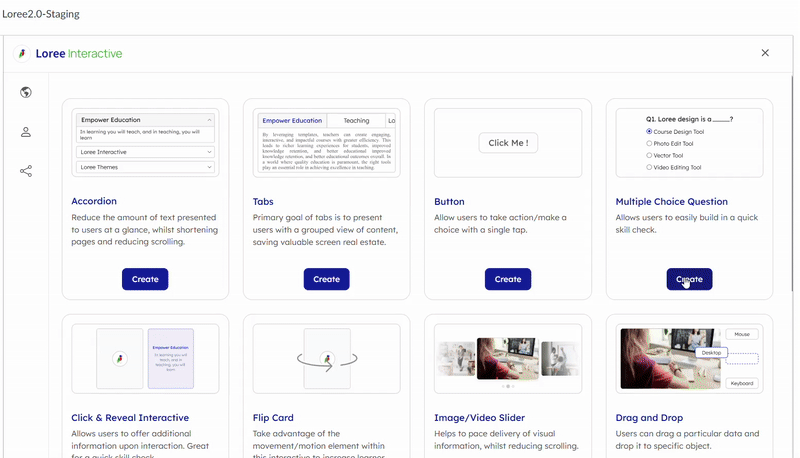
Multiple Choice Question (MCQ)
A Multiple Choice Question (MCQ) interactive is an educational tool or assessment format where users engage with questions presented in a multiple-choice format. Participants are typically provided with a question or problem statement along with a list of possible answers, from which they select the correct option. This interactive format is widely used in online learning platforms, quizzes, and exams to test knowledge, comprehension, and retention efficiently. It allows for immediate feedback on correct or incorrect responses (to the learner in that moment only), aiding in learning reinforcement.
Refer to the Image below:
How to create MCQ Interactive: To create a MCQ interactive, follow these steps:
- Click on the "Create" button located in the Multiple Choice Question interactive section.
- You will be redirected to the page mentioned below, where you can start building your Multiple Choice Question interactive.
| |
| Once the form is open, you'll find the following fields to fill out:
- Interactive Title: This is where you enter a title or name for your MCQ interactive. The title typically appears prominently at the top or serves as a label for the entire set of MCQ interactive.
- Question: In the Question section, formulate your questions using a bubble menu with options to add tables or upload images directly. MCQ interactive sections require a clickable Question that expands or hides additional content.
- Options: The Options section streamlines the creation and organization of answer choices with a user-friendly bubble menu. Multiple options can be easily added, and tips can be included for student support. The correct answer can be indicated with a checkbox, and feedback can be displayed upon selecting the "Show Feedback" option. The "Check Answer" button verifies correctness, and the "Get Results" button presents overall scores. The delete icon allows for the removal of any unwanted options, but a minimum of two options per question is required. This section allows for the inclusion of text, images, links, and other relevant information to enhance user understanding.
|
Add Section for MCQ Interactive:
- MCQ form comes with collapsible sections. You can easily add a section by clicking on the 'Add Section' button, that allows the users to add a section immediately below the existing one. As soon as a new section is added, a + icon will be reflected on the Section Line stating ' Add Section Below'.
- Once a section is added, users can move a section up or down and place it above or below their desired section instead of dragging a section manually using the up or down arrow icons.
- An added section can be deleted easily by clicking the 'Delete' icon that lies on the Section Line. Once this icon is clicked, the 'Remove Section' window pops up asking for confirmation to delete the section, and clicking on the 'Remove' option then deletes the particular section.
Please Note: Whenever a new section is added, users will be redirected to this section, and will not be required to manually navigate around. Users will always be able to return to previous sections by scrolling up (when many sections are present).
Customisation options allow users to personalize and adjust aspects such as fonts, colors, styles, and spacing to suit specific preferences or branding needs. They enhance visual appeal and usability, ensuring content or interfaces meet diverse user requirements effectively. We have provided the following customisation options: Progress Bar, Section, Button, Question Type, Body Border, Behavioural Setting.
Progress Bar:
- Our progress bar can be customised to have a background color and text of your choice.
- You can also change the font, with access to the same fonts in both Loree and Loree Interactive for consistency. Simply select the desired font from the dropdown menu shown in the image.
- Additionally, you can adjust the font style (e.g., normal, H1, H2, etc.), size (6-72 in dropdown), weight (normal, bold, lighter), and alignment (left, center, right) of your section headers.
- You can also define the margin around the section header in pixels.
- To change the color of your text or background, you can use the color palette provided. Alternatively, you can enter specific Hex or RGBA codes for more precise customisation.
| |
| - Within this section option, you have two choices: Background and Option Background.
- The Background option is used to change the background color of the question section, while Option Background is used to adjust the color of the option section. You can select colors from a palette or input specific Hex or RGBA codes to achieve the exact customisation you desire.
|
Button:
- The "Button Customise" options include settings for style, alignment, padding, font family, font size, font color, and background color.
- These options allow users to choose the appearance of the button text and background, including spacing, font style, and color. Users can customise these settings using a dropdown menu or by inputting specific codes.
| |
| Question Type: When customising the question type, we support two options: single select and multi select.
Single Select: Allows users to choose only one answer from the provided options. This is typically used for questions where only one correct answer exists. Multi Select: Allows users to choose multiple answers from the provided options. This type is suitable for questions where there can be more than one correct answer.
These options provide flexibility in designing quizzes, assessments, or surveys, accommodating different types of questions and answer formats as per the user's requirements. |
Body Border: The "Body Border" option in customisation typically refers to the ability to modify the border settings around the main content. Here are some common customisation options for the body border:
Border Style: Choose from options such as solid, dashed, dotted, double, etc., to define the style of the border. Border Color: Specify the color of the border. Border Radius: Set the curvature or roundness of the corners of the border, useful for creating rounded corners. Padding: Define the space between the border and the content inside it.
| |
| Behavioural Setting: Behavioral settings typically refer to functionalities that affect how questions and answers are presented and interacted with. Here are explanations of common behavioral settings: Check Answer Option: This setting allows users to verify if their selected answer is correct. It's often used in quizzes or tests to provide immediate feedback on correctness. Retry Option: Enabling this option allows users to attempt a question again after reviewing feedback or corrections. It's useful for reinforcing learning and improving comprehension. Shuffle Order: This setting randomizes the order in which questions or answer options appear each time the assessment is taken. It helps prevent memorization of sequence-based answers and ensures fairness.
|
The PREVIEW option has been conveniently placed in the far right corner of the form section for all the interactives.
Related Articles
Multiple Choice Question
Multiple Choice Question (MCQ) A Multiple Choice Question (MCQ) interactive is an educational tool or assessment format where users engage with questions presented in a multiple-choice format. Participants are typically provided with a question or ...
Release notes for Loree - Canvas A2301.4
Loree Image is getting replaced while sharing a custom row/element with a department As a Loree user, When we create a row or element with multiple images and then share it with a department the images in the row or element gets replaced by other ...
Release notes for Loree A2004.5
Embed URL Block Loree 2.0 introduces the “Embed URL“ block for the convenience of updating the iframes in the editor directly. For example, YouTube iframe links or any iframe links to get in the page. Table Content customization Loree 2.0 editor now ...
Loree Interactives
Loree Interactive content engages its consumers by requiring active participation. This type of content fosters better interaction between the creator and the audience, making learning easier and more interesting. It presents concepts in an engaging ...
Getting Started
The "Getting Started" section provides users with essential content creation options, allowing them to add various elements to their course or project. Available Options: Text: Insert and format written content. Image: Upload or embed visual ...