The caption in the Image/Video Slider can be fully customized using various style options.
Getting Started
The "Getting Started" section provides users with essential content creation options, allowing them to add various elements to their course or project.
Available Options:
- Text: Insert and format written content.
- Image: Upload or embed visual elements.
- Video: Add multimedia content for better engagement.
- Audio: Incorporate sound or voice recordings.
- Document: Attach and display files for reference.
- Loree Interactive: Likely an advanced tool for interactive content creation.
This structured menu helps users easily integrate different media types, enhancing the learning experience.
Text
The Text element allows you to add text to your page, and when selected, it provides four formatting options:
|
Image
The Images option provides multiple pre-defined layouts to easily add images, text, or a combination of both to your page. Selecting one of these options will place the content into the chosen column. Here’s a breakdown of each available option:
- Banner: Adds a full-width image that spans the entire column, perfect for headers, announcements, or visually striking sections.
- Image: Inserts a standalone image into the column without any accompanying text, ideal for showcasing visuals.
- Centered Image: Places an image at the center of the column, creating a balanced and professional layout.
- Image with Flexi Align: Adds an image with flexible alignment options (left, right, or center), allowing for better customisation based on your design needs.
- Paragraph on Image: Overlays a paragraph of text directly on the image, useful for creating visually engaging banners or highlights.
- Image with Wrap Text: Positions an image with text wrapped around it, providing a dynamic and space-efficient layout for content and visuals.
- Image with Wrap Heading and Paragraph: Similar to the previous option, but includes both a heading and a paragraph wrapped around the image for a more detailed presentation.
- Image with Caption: Adds an image with a caption below, ideal for providing context, descriptions, or credits for the image.
After selecting an option, an image will be added to your course. You can click on the image to replace it with one of your choice. A pop-up (modal) will appear when you double click on the image or single click on the image then click on the replace option on the left side of your screen. This modal allows you to choose from existing course images, user-uploaded images, Loree’s image library, or an icon, or upload a new image using the "Click to upload a new course image" link. This feature makes it simple to personalize your design with the ideal visual elements.
Adding image
When you're adding an image, it's essential to provide a file name and Alt text. We've made it a requirement to ensure accessibility and proper labeling. If you try to leave the Alt text box empty or only add spaces, the "Add image" button will be disabled.You have to either include some text in the Alt text box or select "Decorative Image" to add an image as shown. | |
Image Cropping in Loree
The Loree editor now includes an intuitive image cropping feature, allowing users to crop images into two shapes: a circle or a square. This feature makes it simple to customise images while designing pages. Here’s how it works:
| |
Images can now be cropped with precision, allowing you to select and adjust the crop area exactly as desired. Cropped
images will maintain their shape and alignment across different devices
and screen sizes, ensuring a polished and professional appearance, as
shown. | |
Banner ImageA Banner Image is a prominent visual element displayed at the top of a page or section. It enhances the design, provides context, and can be customized by selecting an image from the library or uploading a new one. Image Cropping for Banner: The image on the left shows the minimum cropping size of 50*50 for any image. The
image crop option is not available for banner images. Instead, when a
banner image that is selected is bigger in size, Icons cannot be used as a Banner Image. | |
Once the user selects their desired top, center, or bottom part of the
banner, clicking on Apply will add the banner in the editor and provide a
variety of editing options on the side as well; refer to the image:  Note: The
Crop Image option will only be available for images that are available
for upload or in the course images. Some of the external images can’t be
uploaded, therefore restricting this Crop Image option for users. Note: The
Crop Image option will only be available for images that are available
for upload or in the course images. Some of the external images can’t be
uploaded, therefore restricting this Crop Image option for users. | |
Upload New Image
The "Click to + ICON" option allows users to upload images in supported formats such as JPG, JPEG, PNG, GIF, and SVG. If the image size exceeds 500KB, the upload time may vary based on the user's internet bandwidth. This feature provides an easy way to add custom images to the course. |
External Link Option
The External Link option allows users to add an image to the course by providing a direct URL instead of uploading a file. This feature is useful when using web-hosted images, reducing storage usage and ensuring easy updates. |
LMS Image Upload Rules
When we save a page to LMS, it will compare the image file with the name and extension first.
If the name and extension are different in S3 and course files, then the file will be uploaded to the LMS course files.
If the file name and extension are the same in S3 and course files, then the file will be hashed to compare the images.
If the images are different after hashing, then the image file will be uploaded.
If the images are the same after hashing, then the image file will be restricted to upload.
The S3 images on the page while we save to LMS will only be compared with the above steps, and no images will be saved again in the LMS.
Note: While checking the image name for duplication, the spaces are filled with %20, and we will remove %20 while comparing the file name while duplication; therefore, if the file name itself has %20, that will be removed while comparing, and in that case, the file with %20 and without %20 might get duplicated since we will remove %20 while comparing.Embed Icons in Loree EditorLoree now offers the ability to add icons while creating templates, providing more flexibility and customisation. We have updates thousands of icons in the Icon library. Here's how the feature works: Where Icons Can Be Used:
How It Works:
|
Customisation Options:Once an icon is added, you can customise the following properties:
|
Important Note: To ensure icons are displayed correctly in the LMS, specific CSS updates are required.
Videos
Videos are easily uploaded to the page, and similar to images, Loree allows users to choose from predefined layouts to assist in completing the page. See below for a screenshot of the layout, and options:
Selecting the video will give you four options as detailed below:
Video | |
Paragraph on Video: Use this option to upload a video with Text on it. | |
Video With Paragraph: | |
Video with Heading and Paragraph: Use this option to upload a video with a Heading and Paragraph text parallel to it. |
After selecting an option, a video will be added to your course. You can click on the video to replace it with one of your choice. A pop-up (modal) will appear when you click the replace option on the left side of your screen. This modal allows you to choose from existing course videos, user-uploaded videos, or upload a new video using the "External Links" option you can insert a link to a video (YouTube, Vimeo, or other external links). After updating the link click next, then give a title to your video and click on Replace to add a Video to your course.
Audio
After selecting audio option you will get a popup modal, This modal allows you to choose from existing course audios, user-uploaded audios, or upload a new audio using the "External Links" option. | |
After updating the link click next, then give a title to your audio and click on add too add a audio to your course. |
Document
| |
| |
|
Loree Interactives:
Loree Interactive content engages its consumers by requiring active participation. This type of content fosters better interaction between the creator and the audience, making learning easier and more interesting. It presents concepts in an engaging and interactive way, transforming the individual from a passive viewer into an integral part of a dynamic, two-way experience.
Refer to the Image below:
To access Loree Interactives, select it from the left-hand side menu, as shown in the screenshot below:
After selecting Loree Interactives, a new left-hand side menu will appear with the following options:
Choosing "Create New" will take the user to the dashboard pop-up (modal), as shown below:
Loree Interactives Dashboard:
The Loree Interactives (LI) dashboard features nine interactive components: Accordion, Tab, Button, MCQ, Click & Reveal, Flip Card, Video/Image Slider, Drag and Drop, and Image Hotspot. Users can easily create a component by clicking the "Create" button.
Accordion
Accordion:
An interactive accordion is a popular UI element in web design and development, featuring vertically stacked collapsible panels. Each panel has a clickable title or header that expands to show additional content. This design allows users to efficiently navigate information, accessing only the sections they need while keeping the interface neat and organized.
Here is a short video on how an Accordion works:
Here is a short video on how an Accordion works:
How to create an Accordion:To create an accordion, follow these steps:
|
Once the form is open, you'll find the following fields to fill out: Accordion Interactive Title: Input a title or name for the interactive accordion. Section Header: Enter a title for each section, which can be expanded or collapsed by users. Section Body: Input content to be displayed when the section is expanded. |
Add Section for Accordion
- The Accordion form has collapsible sections. To add a new section, click 'Add Section' and a '+' icon will appear on the section line stating 'Add Section' below. Refer to the images.
- After adding a section, users can easily move it to their desired location using the arrow icons displayed in the image.
- To delete a section, click the 'Delete' icon on the Section Line and confirm the deletion by selecting 'Remove.'
 Please Note: Whenever a new section is added, users will be redirected to this section, and will not be required to manually navigate around. Users will always be able to return to previous sections by scrolling up (when many sections are present).
Customize Options
Customization options allow for users to personalize and adjust visual aspects like fonts, colors, styles, and spacing to fit preferences or branding. They improve appearance and usability to meet user requirements, with options for Section Headers, Borders, and Icons provided.
Section Header: Users can customize section header appearance by modifying: 1. Font Family, 2. Font Style, 3. Font Size, 4. Font Weight, 5. Alignment, 6. Margin (px), 7. Font Color, 8. Background Color.
|
Border: 1. A border outlines and separates content, adding structure and enhancing appearance. 2. You can customize its color and thickness and choose from different border styles. The border radius allows for rounded edges. |
| Icon: Icons represent dropdown interfaces with two types: Arrows and Plus/Minus radio buttons |
Preview:
The PREVIEW option has been conveniently placed on the far right side corner of the form section for all the interactives.
THANK YOU!
Tab
TABS Interactive
The primary goal of Tabs Interactive is to present users with a grouped view of related data, which in turn allows content builders to modularize groups of information in a compact manner, saving valuable screen real estate.
Here is a short video on how Tabs Interactive works:
How to create Tabs Interactive:
To create a Tabs interactive, follow these steps:
|
Once the form is open, you'll find the following fields to fill out: Interactive Title: Input a title or name for the Tabs interactive. Section Header: Enter a title for each section, which can be expanded or collapsed by users. Section Body: Input content to be displayed when the section is expanded. |
'Add Section' for Tabs Interactive:
- The Tabs interactive form has collapsible sections. To add a new section, click 'Add Section,' and a '+' icon will appear on the section line stating 'Add Section' below. Refer to the images.
- After adding a section, users can easily move it to their desired location using the arrow icons displayed in the image.
- To delete a section, click the 'Delete' icon on the Section Line and confirm the deletion by selecting 'Remove.'
Please Note: Whenever a new section is added, users will be redirected to this section, and will not be required to manually navigate around. Users will always be able to return to previous sections by scrolling up (when many sections are present).
Customize Options: Customization options allow for users to personalize and adjust visual aspects like fonts, colors, styles, and spacing to fit preferences or branding. They improve appearance and usability to meet user requirements, with options for Section Headers, Borders, and Icons provided.
Section Header:
| |
| | Border: 1. A border outlines and separates content, adding structure and enhancing appearance. 2. You can customize its color and thickness and choose from different border styles. 3. The border radius allows for rounded edges. |
Preview:
The PREVIEW option has been conveniently placed on the far right side corner of the form section for all the interactives.
THANK YOU
Button
Button Interactive:
A Button interactive is a clickable element in a user interface that triggers an action, such as dialogs, modal windows, forms, cards, and toolbars. It provides a straightforward way for users to interact with the application.
Here is a short video on how Button Interactive works:
How to create a Button Interactive:To create a Button Interactive, follow these steps:
| |
Once the form is open, you'll find the following fields to fill out: Interactive Title: Input a title or name for the Button interactive. Button Name: Each interactive button has a clickable name that can expand or collapse to show or hide more content. Button Link: A button link combines the look of a button with the functionality of a hyperlink, allowing navigation to different pages or sections within an app or website. It can open the linked content in a new tab or the same tab, using radio buttons. | |
Add Link: You can now easily add and manage links directly within your interactive content using the new, all-in-one Link Modal. Choose course items from Canvas and link them in one click, attach links to selected text or automatically created labels, and even link images. You can connect to Canvas content or any external URL, control how links open or where they jump, and use the new Email tab to create email links instantly. Refer to our Release Notes Version A2504.1 for more details on Add link modal. |
Customize Options:Customization options allow users to personalize and adjust fonts, colors, styles, and spacing to suit preferences or brand needs, enhancing appeal and usability. For Button interactives, options include types, alignment, padding, font family, size, color, and background for emphasis and readability. |
Preview:
The PREVIEW option has been conveniently placed on the far right side corner of the form section for all the interactives.
THANK YOU
Multiple Choice Question
Multiple Choice Question (MCQ)
A Multiple Choice Question (MCQ) interactive is a learning and assessment tool where users respond to a question by selecting one or more answers from a set of predefined options. Commonly used in online courses, quizzes, and exams, this format helps measure understanding and retention while providing a simple, structured way for learners to engage with content. MCQ interactives also allow for instant feedback, making them effective for reinforcing learning and evaluating performance.
Here is a short video on how Multiple Choice Question works:
How to create an interactive MCQ:
To create a MCQ interactive, follow these steps:
| |
| | Once the form is open, you'll find the following fields to fill out:
|
Add Section for MCQ Interactive:
The MCQ form is designed with collapsible sections to help you organize your content more easily.
You can add a new section at any time by clicking the Add Section button. This instantly creates a section right below the current one. After a section is added, you'll also see a + (Add Section Below) icon on the section line for quick access.
Need to move a section? You can shift it up or down using the arrow icons. This lets you place the section exactly where you want without needing to drag it manually.
If you want to remove a section, simply click the Delete icon on the section line. A confirmation window titled "Remove Section" will appear—select "Remove" to permanently delete that section.
Please Note: Whenever a new section is added, users will be redirected to this section, and will not be required to manually navigate around. Users will always be able to return to previous sections by scrolling up (when multiple sections are present).
Customization Options
Customization settings allow you to tailor the look and feel of your MCQ interactive so it aligns with your branding and design preferences. These options help you adjust fonts, colors, styles, spacing, and other visual elements to create a polished and engaging learner experience.
- We currently offer the following customization categories: Progress Bar, Section, Option, Button, Question Type, Body Border, Behavioural Setting.
- Each of these options helps you fine-tune the appearance and behavior of your interactive, ensuring it meets your design standards and enhances overall usability.
Progress Bar: The progress bar comes with flexible customization options so you can match it to your course design or branding.
| |
Section: |
|
| Option: Users now have greater flexibility in customizing the appearance and layout of MCQ options.
| |
Button:
| |
| | Question Type: You can customize how learners interact with each question by choosing from two supported question types:
These options offer flexibility when designing quizzes, assessments, or surveys, helping you match the interaction style to the needs of your content. |
Body Border: The Body Border customization settings let you control the appearance of the border around the main content area. You can adjust:
| |
| | Behavioural Setting: Behavioural settings control how learners interact with questions and how feedback is delivered. These options help you shape the quiz experience to support learning, engagement, and fairness.
|
Preview:
The PREVIEW option has been conveniently placed on the far right side corner of the form section for all the interactives.
THANK YOU!
Click & Reveal Interactive
Click & Reveal Interactive
Click & Reveal interactive elements let users click on an item to uncover hidden content. This feature helps manage screen space effectively and offers an engaging way to access additional information.
Here is a short video on how Click & Reveal works:
How to create Click & Reveal Interactive:
| |
| | Once the form is open, you'll find the following fields to fill out:
|
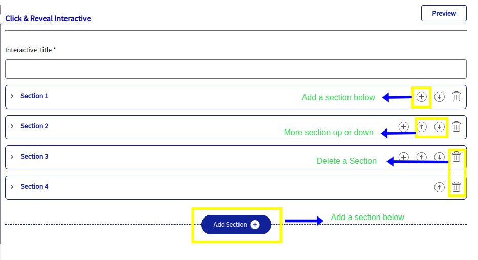
Add a section for Click & Reveal
- Click the 'Add Section' button to add collapsible sections below existing ones in the Click & Reveal form.
- A '+' icon appears on the section line to 'Add Section Below' for adding new sections.
- Use the up or down arrow icons to move sections instead of dragging.
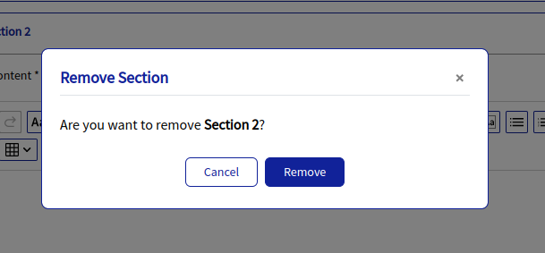
- Click the 'Delete' icon on the section line, confirm in the 'Remove Section' window, then click 'Remove' to delete.
Please note: Whenever a new section is added, by default, it will be directly reflected instead of navigating to the previous section.
Please note: Whenever a new section is added, by default, it will be directly reflected instead of navigating to the previous section.
Customize Options:
Personalize fonts, colors, styles, and spacing to enhance visual appeal and usability for Click & Reveal Interactive.
Click Content Includes options for Height, Padding (px), Border color, Border size (px), Border style, Border radius, and Background color. | ||
| |
|
Highlight key information and make a memorable impression with the following customization options:
- Height: A height input field is now available in the Design section. The default height is set to 318 px, and you can adjust it anywhere between 100 px and 999 px. This feature supports both text and image content, giving you more control over the layout and visual presentation.
- Padding (px): Controls the space inside an element’s border, improving readability and overall layout.
- Color: Allows you to set the border color using the color palette or by entering Hex/RGBA values for precise customization.
- Border Size (px): Defines the thickness or width of the border in pixels.
- Border Style: Lets you choose the border’s visual style, such as Solid, Dashed, Dotted, Double, Groove, or Ridge.
- Border Radius: Adjusts the roundness of the border corners to create a softer, more modern look.
- Background Color: Sets the background color behind the text to enhance contrast and visibility, using either the color picker or custom Hex/RGBA codes.
Preview:
The PREVIEW option is conveniently located in the far right corner of the form section for all interactive elements, allowing easy access for reviewing your changes.
THANK YOU!
Flip Card
Flip Card
Flip card interactive elements are user interface components that flip to reveal additional content when clicked or hovered over. They provide a dynamic way to present information, combining both front and back content areas to maximize space and engagement.
Here is a short video on how Flip Card works:
How to create a Flipcard?
To create a Flipcard interactive, follow these steps:
| |
Once the form is open, you’ll see the following fields to complete:
|
Add a section for Flip card:
- Click the 'Add Section' button to add collapsible sections below existing ones in the Flipcard form.
- A '+' icon appears on the section line to 'Add Section Below' for adding new sections.
- Use the up or down arrow icons to move sections instead of dragging.
- Click the 'Delete' icon on the section line, confirm in the 'Remove Section' window, then click 'Remove' to delete.
- Click the 'Add Section' button to add collapsible sections below existing ones in the Flipcard form.
Please Note: Whenever a new section is added, users will be redirected to this section, and will not be required to manually navigate around. Users will always be able to return to previous sections by scrolling up (when many sections are present).
Customize Options:
- Personalize fonts, colors, styles, and spacing to suit specific preferences or branding needs.
- Enhance visual appeal and usability, meeting diverse user requirements effectively.
Card Type Customize the appearance of your cards, including their type, number per row, and event interactions to match your page's aesthetics. Type: Select either Square or Portrait for the card shape. Number of Cards per Row: Choose how many cards to display per row, with options ranging from 1 to 4, to ensure optimal visual organization. Event Options: Configure interactions such as hover effects or click actions to enhance user engagement. |
| | Card Front Enhance the front of your card to create engaging initial views that capture attention and encourage interaction. Highlight key information and make a memorable impression with the following customization options:
|
Card Back Enhance the card back in flip cards to provide detailed information or additional content, enriching user interaction and understanding. It mirrors the Card Front customization options. | |
Preview:
The PREVIEW option is conveniently located in the far right corner of the form section for all interactive elements, allowing easy access for reviewing your changes.
THANK YOU!
Image/Video Slider
Image/Video Slider Interactive
An image/video slider is a dynamic user interface element commonly found on websites, featuring a carousel or slideshow format to display multiple images or videos in a single area. It allows users to view content sequentially through navigation controls like arrows or dots, with options for automatic or manual transition between slides. Sliders are versatile for showcasing products, portfolios, or promotional content, offering visual engagement and enhancing the user experience with responsive design.
Here is a short video on how the Image/Video Slider works:
How to create an interactive Image/Video Slider?
To create an Image/Video Slider, follow these steps:
| |
Once the form is open, you’ll see the following fields to complete:
| |
Upload Image:
| |
Upload Video:
|
Add Section for Image/Video slider:
The Image/Video Slider form includes collapsible sections that make organizing your media simple and intuitive.
- Click the Add Section button to insert a new section directly below the current one. Once added, a + (Add Section Below) icon will appear on the section line for quick access.
- Reordering Sections: You can move a section up or down using the arrow icons. This lets you position sections exactly where you want them without needing to drag them manually.
- To remove a section, click the Delete icon on the section line. A Remove Section confirmation window will appear—select Remove to permanently delete that section.
- These features make it easy to structure, update, and manage your slider content efficiently.
Please Note: Whenever a new section is added, users will be redirected to this section, and will not be required to manually navigate around. Users will always be able to return to previous sections by scrolling up (when many sections are present).
Customize Options:
The Image/Video Slider includes the following customization options to help you tailor the look and feel of your content:
Caption: Customize the text that appears below each image or video to provide context or descriptions.
Icon: Choose or update the icon used within the slider for a more personalized visual style.
Image/Video Background : Adjust the background behind your media to enhance contrast, visibility, and overall design.
Caption:
| |
Icon: Icon customization includes
| |
Image/Video Background:
| |
Preview
The PREVIEW option has been conveniently placed on the far right side corner of the form section for all the interactives.
THANK YOU!
Drag and Drop
Drag and Drop
Drag and drop functionality refers to the ability for users to click and hold on an object (such as an image, file, or element) and move it to a different location by dragging it with the mouse cursor. This interaction allows users to rearrange, reorder, or transfer items within a user interface intuitively. It is commonly used in various applications and websites to enhance user experience by enabling seamless and efficient manipulation of content or elements.
Here is a short video on how Drag and Drop works:
How to create Drag and Drop Interactive:
To create a Drag and Drop interactive, follow these steps:
| |
|
Customizations
- In the Customize menu, you'll find the Drop Zone Layout section, offering two options: Custom and Fixed.
Drop Zone Layout (Custom): To create a custom layout, follow these steps: Add/Edit Drop Zones:
| |
Drop Zone Layout (Fixed):
|
Add Section Option for Drag and Drop
- The Drag and Drop form uses collapsible sections for easy organization.
- To add a new section, click Add Section, and a plus icon will appear showing where you can insert it. After adding a section, you can move it up or down using the arrow icons.
- If you need to remove a section, just click the Delete icon and confirm by selecting Remove.
Please Note: Whenever a new section is added, users will be redirected to this section, and will not be required to manually navigate around. Users will always be able to return to previous sections by scrolling up (when many sections are present).
Customize Options
Customization options let you tailor fonts, colors, styles, and spacing to match your design or branding needs. These settings help improve both visual appeal and usability. All of these customization features 1. Draggable Area. 2. Drop Zone Area. 3. Button are available for the Drag and Drop interactive.
Draggable Area:
| |
| | Drop Zone Area: The drop zone area can be customized to match your design.
|
Button Customization Supports button styles like pill, outline, and pill-shaped, with options for rounded edges, transparency, and elongated shapes.
| |
Preview:
The PREVIEW option has been conveniently placed on the far right side corner of the form section for all the interactive.
THANK YOU
Image Hotspot
Image Hotspot
An image hotspot interactive allows users to click on specific areas (hotspots) within an image to reveal additional information or media. This enhances user engagement by providing an intuitive and visually appealing way to explore detailed content within an image.
Here is a short video on how Image Hotspot works:
How to create Image Hotspot Interactive:
To create an Image Hotspot Interactive, follow these steps:
| |
Once the form is open, you'll find the following fields to fill out:
|
|
|
| |
| | Users can preview their work using the PREVIEW option, now located at the top right side of the form section |

Please Note: We’ve also improved the hotspot pop-up behavior. If your content is larger, the pop-up height now adjusts dynamically. It can expand smoothly up to 800 pixels without showing a scrollbar. If the content goes beyond that limit, a scroll bar appears inside the modal so everything stays readable and accessible.
Add Section for Image Hotspot:
- The Image Hotspot form includes collapsible sections for easy organization.
- To add a new section, click Add Section, and a plus icon will appear on the section line showing Add Section Below.
- Once a section is added, you can move it up or down using the arrow icons to place it exactly where you want; no manual dragging is needed.
- To delete a section, click the Delete icon and confirm by selecting Remove in the pop-up window.
Please Note: Whenever a new section is added, users will be redirected to this section, and will not be required to manually navigate around. Users will always be able to return to previous sections by scrolling up (when many sections are present).
Customize Options:
Customization options in the Image Hotspot interactive allow users to personalize fonts, colors, styles, and spacing, enhancing visual appeal and usability tailored to specific preferences or branding needs.
Icon: Icon customization for image hotspots enables users to select or upload icons representing points of interest in an image. These icons can be customized in type, size, color, and background color to integrate seamlessly with the design and improve usability.
1. Type: You can customize your hotspot icons in several ways. Choose the icon type to mark clickable points on your image and guide users visually. 2. Icon Size: Adjust the icon size anywhere from 6 to 72 using the dropdown menu. 3. Icon Color: Update the icon color to match your branding or improve visibility, using either the color palette or Hex and RGBA codes. 4. Background Color: You can also change the background color behind the icon for extra contrast, with the same easy color selection options |
THANK YOU!
Embed
After creating an interactive, you can click on the Embed option on the right side of the screen to insert it into the editor. If you need to make changes, click on the Edit option to modify the interactive. Alternatively, you can discard it by clicking on the "X" (Close) icon.
To Embed an existing interactive from My Interactives, Shared Interactives, or Global Interactives, simply click on the Embed button on the right side of the interactive. This will insert the interactive directly into your editor's page.
All fonts and sizes for headers and paragraph text will be determined by the predefined values set in the admin dashboard.
THANK YOU
Related Articles
Loree Enhanced UI User Manual
Welcome to the world of Loree Your go-to resource for mastering the Loree editor and its powerful features. Explore the sections below to quickly navigate to the specific guides you need. Landing Page Get started with the Loree editor! Learn how to ...Loree End User Manual
Welcome to the world of Loree Your go-to resource for mastering the Loree editor and its powerful features. Explore the sections below to quickly navigate to the specific guides you need. Understanding Course Navigation in Loree You’re all set! The ...Release Notes for Loree A2403.3
Published on: 31/07/2024 Feature Enhancements 1. Enhance Customization for Active and Inactive Tab Text Colour Earliers, when Loree users created a Tabs Interactive, the customize section applied the same font color style to both Active and Inactive ...Interactive Elements
Introduction In the Loree editor, H5P is available under the Interactive Elements section. It allows you to create fun and engaging content by adding more than 20 + interactive elements like hotspots, multiple-choice questions, and accordions using ...Loree Interactive Style Management in admin dashboard
Getting started We are happy to introduce the Loree Interactive feature in the admin dashboard. From the admin dashboard, admins can effortlessly customize styles and manage their Loree Interactive content. Benefits of a Loree Interactive feature in ...