Click & Reveal Interactive
Click & Reveal Interactive
Click & Reveal interactive elements let users click on an item to uncover hidden content. This feature helps manage screen space effectively and offers an engaging way to access additional information.
Here is a short video on how Click & Reveal works:
How to create Click & Reveal Interactive:
| |
Once the form is open, you'll find the following fields to fill out:
|
Add a section for Click & Reveal
- Click the 'Add Section' button to add collapsible sections below existing ones in the Click & Reveal form.
- A '+' icon appears on the section line to 'Add Section Below' for adding new sections.
- Use the up or down arrow icons to move sections instead of dragging.
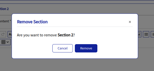
- Click the 'Delete' icon on the section line, confirm in the 'Remove Section' window, then click 'Remove' to delete.
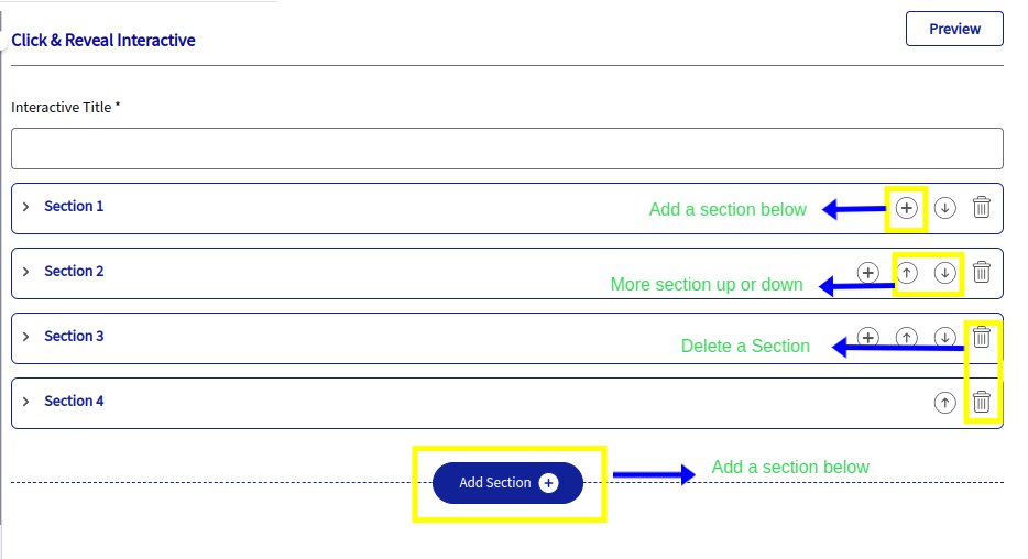
 Please note: Whenever a new section is added, by default, it will be directly reflected instead of navigating to the previous section.
Please note: Whenever a new section is added, by default, it will be directly reflected instead of navigating to the previous section.
Customize Options:
Personalize fonts, colors, styles, and spacing to enhance visual appeal and usability for Click & Reveal Interactive.
Click Content Includes options for Height, Padding (px), Border color, Border size (px), Border style, Border radius, and Background color. | ||
|
Highlight key information and make a memorable impression with the following customization options:
- Height: A height input field is now available in the Design section. The default height is set to 318 px, and you can adjust it anywhere between 100 px and 999 px. This feature supports both text and image content, giving you more control over the layout and visual presentation.
- Padding (px): Controls the space inside an element’s border, improving readability and overall layout.
- Color: Allows you to set the border color using the color palette or by entering Hex/RGBA values for precise customization.
- Border Size (px): Defines the thickness or width of the border in pixels.
- Border Style: Lets you choose the border’s visual style, such as Solid, Dashed, Dotted, Double, Groove, or Ridge.
- Border Radius: Adjusts the roundness of the border corners to create a softer, more modern look.
- Background Color: Sets the background color behind the text to enhance contrast and visibility, using either the color picker or custom Hex/RGBA codes.
Preview:
The PREVIEW option is conveniently located in the far right corner of the form section for all interactive elements, allowing easy access for reviewing your changes.
THANK YOU!
Related Articles
Interactive Elements
Introduction In the Loree editor, H5P is available under the Interactive Elements section. It allows you to create fun and engaging content by adding more than 20 + interactive elements like hotspots, multiple-choice questions, and accordions using ...Checklist Interactive
Checklist Interactive A Checklist Interactive lets you add simple, checkable task lists directly into your course, making it easy for learners to stay organized. Learners can tick off items as they go, helping them clearly see their progress. Here is ...Release notes for Loree A2401.3
24 January, 2024 Feature Enhancements Enhanced customization options for "Tabs" Interactive: Ability to add a separator line between Tabs: A new style in Loree Interactive allows you to customize your tabs and enhance their visual appeal. With this ...Loree Interactive Style Management in admin dashboard
Getting started We are happy to introduce the Loree Interactive feature in the admin dashboard. From the admin dashboard, admins can effortlessly customize styles and manage their Loree Interactive content. Benefits of a Loree Interactive feature in ...Release notes for Loree A2401.5
2 February, 2024 Bug Fixes Alignment issues on Click and Reveal Issue Statement: The alignment of content is not effective on left alignment of click and reveal contents. When it set to Left alignment, it still overwrites with Justify alignment. ...